` element**. The `
` element** under the `
` element. The `
` element should contain your position or job title (like `Student at Unicorn High` or `Editor Extraordinaire at DHS Yearbook`).
- Your updated code should look like this:
```html
Halle Bot
Mascot at Operation Spark
```
---
|
💡 Why Add Your Name and Position?
|
|
This personal touch makes your website feel more professional and unique. It also gives visitors insight into who you are.
|
---
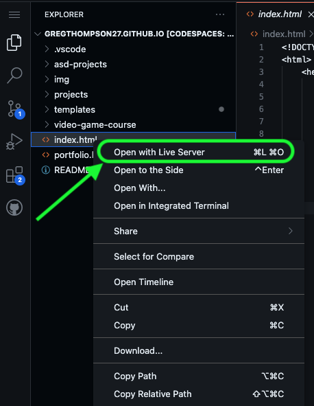
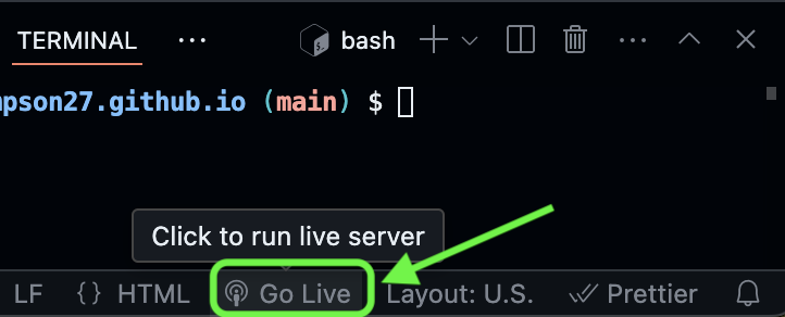
### ✅ **Check Your Work!**
- **Preview your site** using **Live Server**.
- Verify that your basic page looks like the image below before moving on.
## **TODO 5: Add More Content – Interests**
🎯 **Goal:** Add a list of your interests to personalize your site and practice using HTML lists.
---
### Step-by-Step Instructions
1. 🔍 **Find the `
` element**
- Look for this section in your code:
```html
```
2. **Create a new `
` for the Interests section**
- **Inside the `
` element**, add a new `
` element with an `id="interests"` attribute:
```html
```
3. **Add a heading inside the Interests div**
- **Inside the `
` element**, add an `
` element with the text `Interests`:
```html
Interests
```
4. **Create an unordered list for your interests**
- Below the `` tag, add a `` element:
```html
```
5. **Add three list items for your interests**
- Inside the `` element, add three `- ` elements to list your interests.
- Inside each of the `
- ` elements, include one of your interests, such as `Coding`, `Football`, or `Sleeping`.
After completing this TODO, your updated `
` element should look like this:
```html
Halle Bot
Mascot at Operation Spark
Interests
- Coding
- Running
- Baking Cupcakes
```
---
|
💡 Why Use Lists?
|
|
Lists help organize information neatly on your website. You’ll often use lists in web development for things like navigation menus, to-do lists, and item descriptions.
|
---
### ✅ **Check Your Work!**
- Ensure the `
` section is **inside the `
` element**.
- **Preview your site** using Live Server. You should see a list of interests below your name and title.
🎯 **You're halfway there! Keep it up!**
## **TODO 6: Add an Image**
🎯 **Goal:** Add a personal or meaningful image to the sidebar section.
---
### Step-by-Step Instructions
1. 🔍 **Find the `